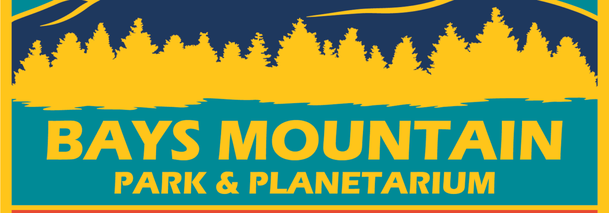
Bays Mountain Park & Planetarium Adopts New Logo
After an overwhelmingly positive response from the Kingsport community, Bays Mountain Park & Planetarium will be adopting a new official logo that celebrates the park’s 50 years of history.
The new logo was developed during the preparation for the 50th anniversary celebration of Bays Mountain Park. After the logo was revealed to the public, the consensus was clear—this fresh and colorful logo was the perfect fit for the much-beloved park. The updated logo is the same as the one used for the year-long anniversary event, but without the “50 Years” circle, to make the logo fitting for all of the years to come.
While developing the logo, there were many factors to consider. Since the park opened in 1971, park staff wanted to use colors and fonts that were popular around that time.
“I took a lot of inspiration from record album art from the late 60’s and early 70’s,” said Cassandra Rose, logo designer and exhibits technician.
The silhouette of Bays Mountain within the logo also matches the one in the City of Kingsport’s logo, keeping the park connected to the rest of the city. The area below the mountain represents the view of the reservoir ringed by trees. And, of course, there is a starry sky above the mountain scene to represent the planetarium.


